
If we were to ask you to spot the logo on this page, would you be able to do that? We’re sure it’s no biggie for you.
Well, that little exercise checks out the essential knowledge part. Now that we’re confident you know what a logo is, let us first break down to you why a logo is significant in the first place?
A logo isn’t the whole brand. However, it does help in the accurate representation of your brand in the market. It can tell a lot about “who you are” & “what you do.”
To put it otherwise, a logo is a critical element of your brand’s identity.
You might not be convinced of this fact just yet, but we’re sure you’ll have a very different opinion in a second.
Imagine you were on a highway, and you are starving, with no food outlets near you whatsoever, but you thankfully spot the classic yellow “M” written from afar.
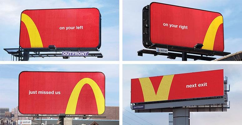
You will not even for a second question that it’s not your favourite fast-food restaurant. We know the big yellow “M” signifies Mc Donalds by now.
But this hasn’t been the case always, right? The most loved burger joint didn’t become this big brand overnight. Yet, had it not given enough weightage to branding, it wouldn’t have left such a lasting impression on its audience.
The crux of the whole build-up is that you can not even for a second underestimate the importance of your brand‘s logo. Thus, logo variations!
We get a logo, but what are logo variations afterall?
Logo variations are nothing fancy but your primary logo in different formats altered to fit on other platforms.
If you currently own a business for which you have tried to establish an online presence, you must at least have your primary logo in place. The problem with having only one symbol is that it does not fulfil all your requirements.
You will one hundred percent face problems trying to fit it in different formats like social media, letterheads, postcards, menus, merchandising, etc.
This is why it becomes essential to have different logo variations, so you can communicate your brand’s “who” & “what” efficiently on various touch points.
You need different variations to fit various sizes, shapes, and usability requirements.
These variations are versatile but never in contrast with the entire brand identity.
So how many logo variations are there, ideally?
Every professional will have a different answer to this question, but we’ve categorised five significant logo variations for better understanding.
1. Primary
Your primary logo is the one you will use most often, which is why it is a complete logo, unlike others. With your primary logo begins the process of crafting varied logo variations as each variation will be drawn out of it.
Another thing about your brand’s primary logo is that it will consist of every detail like the brand name, tagline, date of incorporation, mascots, and more.
Usually, brands prefer to keep their primary logos horizontal. However, there’s no hard and fast rule, and one can make changes depending on the theme and design. Note that it is essential that your primary logo has the required breathing space and is not cluttered with unrequired elements.
Most of all, your primary logo must be adaptable, so matter which format you put it in, it looks seamless and beautiful.
As a new brand in the market, you must only keep a single primary logo. Since your brand recognition at the moment is more minor, multiple ones can confuse your audience. However, some big brands like Adidas get the pass for playing with stuff considering the large audience it caters to already; people hardly can get confused with it.
For instance, look at the image below; you will understand how we have created variations for our brand by sticking to our brand identity and guidelines.

2. Stacked
Also known as a secondary or vertical logo, the primary objective is to have a distinct structure from the primary one.
Like in the Van Heusen logo shown before, the logo sits above the brand name. A secondary variation of this could be with the logo on the left of the brand’s reputation. As shown below:

The secondary logo is in many ways similar to the primary logo; it basically complements your brand identity and persona.
Your secondary logo will come in handy when there are space restrictions and when your primary logo fails to support it.
A secondary logo, in a nutshell, is structured in the different orientations of your primary logo for variation.
3. Submark
A submark is a more simplified and clarified version of the primary logo, and it usually is reduced from several elements to one or two most important ones.
This one helps when you need to work in a very restricted space. Usually, a submark is either a circle with relevant symbols and text or a single symbol. If you have a very simplified logo that most businesses today prefer, you might not feel the need to have a submark.
Although, it is recommended to have one, just in case.
If you own a playful brand, you can create submarkets in the form of badges, stickers, and merchandise. It can help market your brand more efficiently and make people remember you.
4. Favicon
A favicon is another tiny version of your logo that is mainly used as a symbol representing your brand while browsing.
So in case, a person has a habit of opening a zillion tabs while browsing the internet, the icon on the tab will make it easy for them to remember you.
It helps people easily recognize your brand and also spreads brand awareness. Although it does not have many uses, the single service significantly impacts itself. Not just that, you can always repurpose it for an app’s icon or even maybe for social media, depending upon the requirement.
5. Reverse out
Last but not least, a reversed out logo is a single-colour version of the one you already have. For official purposes, you must have a white and a black version of your colourful logo.
Although it’s no mandate to have one, you can surely put it to use once made. Moreover, this makes the logo quite versatile as you can read it well on varied backgrounds like this.
It’s also very cost-effective compared to other available options; this is great for small businesses and startups yet to finalize their brand colours.
Businesses can present a more professional image to the market by using different logos. It can support maintaining a consistent brand image and make a brand appear more adaptable. The goal of branding is to convey your brand’s message to the target market, and strong branding encourages the development of sincere relationships with customers. Having multiple logos allows you to maintain your brand message across various touch points.